
Context
The brief.
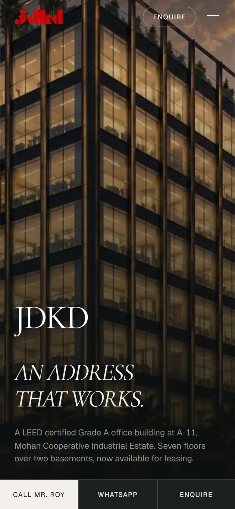
JDKD Corporate Tower is a Grade A, LEED-certified office building on Mathura Road in New Delhi, open for leasing. JDKD is among the most premium corporate builders in the country, and the people deciding on a lease compare floor plates and specifications for a living.
The brief was to give the market a feel for the quality of JDKD’s work, and to turn interest into the one thing that closes a lease: a private walkthrough.
How does a website carry the quality of a building to someone who hasn’t stood in it yet?
Context
The problem.
Brochures all look the same.
Tenants have seen every glossy render going. Adjectives don’t move them.
Specs decide, not slogans.
Floor heights, access and certification have to be on the page before anyone asks.
The goal is a visit.
A lease starts with a walkthrough, so every page had to lead there.
Outcome
What we built.
The specification, first.
A corner plot open on two sides, seven office floors over two basements, 14 ft 9 in floor heights, and 350 m to Sarita Vihar Metro.
A walkthrough scheduler.
Pick the area, the floor and your timeline. The request lands in the leasing team’s sheet and inbox.
A floor-plan viewer.
Explore the building’s plates floor by floor, without downloading a PDF.
A design system taken from the tower.
Type, spacing and colour measured from the developer’s own tower deck, so the site and the building speak the same language.
Every project, with its own page.
The Corporate Tower sits alongside the developer’s other buildings, one enquiry away from anywhere.
Conclusion
What we took away.
Premium is precision.
The site feels expensive because nothing on it is vague.
Design for the decision.
Every page exists to get a tenant to the walkthrough.
