
Context
The brief.
Team K produces video, animation and content for creators and brands, much of it AI-generated, and its client list is its best argument: some of the biggest names on Indian YouTube and Instagram.
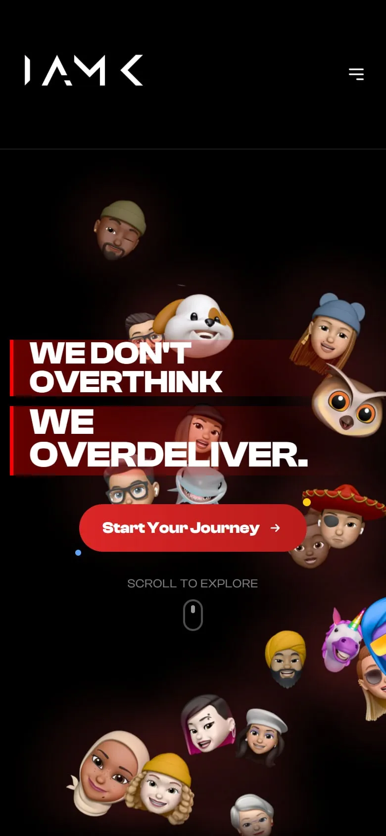
The brief asked for a playful site, loud enough to match the work, that makes that list land fast and then gets out of the way.
How do you make a site feel like the team’s energy, and still sell what it does?
Context
The problem.
The client list is the pitch.
Some of the biggest names on Indian YouTube and Instagram. That had to land in seconds.
Playful, but still a business.
Fun that forgets to explain the services doesn’t book work.
A lot to show.
Brand work, animation, AI content and creator edits, all in one place.
Outcome
What we built.
A moving wall of creators.
Each shown with their handle and audience, doing the introductions before any pitch.
Every service, plainly listed.
Brand identity, video production, 2D animation, scripting, motion design, web design, and social and content strategy.
Proof, then pitch.
Brand work and testimonials from the teams they edit for come after you’ve already seen who they work with.
Conclusion
What we took away.
Proof before pitch.
By the time you reach the services, the creator wall has already made the case.
Playful needs a spine.
Loud colour and motion work best on a layout that never makes you hunt.
