
Context
The brief.
K2India is a New Delhi architecture and design practice founded by Sunita Kohli (Padma Shri, 1992) and her daughter, architect Kohelika Kohli. It works across architecture, interiors, styling, landscape and bespoke furniture, from India to Egypt and England.
Work that careful needs a site that doesn’t shout over it.
How much should a website say when the photographs already say it?
Context
The problem.
The work is the argument.
Decades of residences, interiors and furniture. The site’s job is to show it, not describe it.
Many disciplines, one practice.
Architecture, interiors, styling, landscape and furniture, plus KoKo and Karkhana, without a crowded home page.
Scale is hard on a screen.
A 30,000 sq ft residence has to feel like one.
Outcome
What we built.
Image-led, quiet by design.
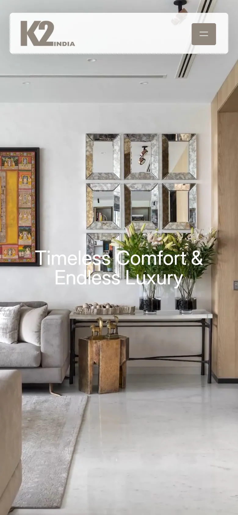
It opens on “Architecture with intention and interiors with soul” and then gets out of the way: big photographs, short facts, plenty of space.
Every residence, with its numbers.
Area and location up front, each opening into its own project.
Everything else, in its place.
The disciplines, KoKo and Karkhana, awards and news, all reachable without crowding the home page.
Conclusion
What we took away.
Let the photographs lead.
For a practice this good, the layout’s job is restraint.
Fewer words, more weight.
A line of facts under a great photograph says more than a paragraph.
