
Context
The brief.
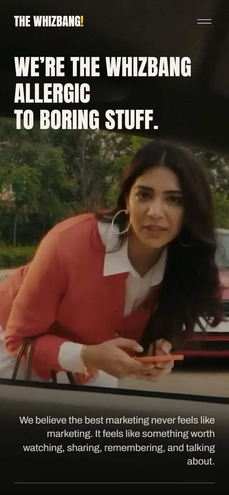
The Whizbang’s brief had one word for the feeling it wanted: faadu. Cool, playful, bold, a little disruptive. The site had to stand apart from every other agency’s, carry the studio’s own elements, and move like the best motion studios on the web without leaning on 3D.
The copy came from the client. Our job was to stage it: build a set around their lines, and add the wordplay that ties the pages together.
How do you make an agency’s website feel like watching its work, before a single video plays?
Context
The problem.
Every agency site says bold.
Loud claims are the category default. This one had to prove it with how it moves, not with adjectives.
76 videos, one page load.
Brand films, reels and AI work are heavy. The site had to show all of it and still open fast on a phone.
Reels have habits.
People watch short-form a certain way: tap to pause, swipe for the next. A player that ignored that would feel wrong in the hand.
Approach
How we played it.
Treat it like a set.
Filmmaking is the theme, not the decoration. The Brand Films hero reads “Lights. Camera. Bang!” and its button says “Roll camera”.
Their words, our timing.
The copy is the client’s, word for word. We added the wordplay around it and decided when each line lands.
2D on the GPU, never 3D.
Hand-written WebGL shaders give the motion its weight, without a 3D scene to download first.
Outcome
What we built.
A projector that follows the copy.
A beam of light brightens word by word across the Brand Films hero, with a projector’s hum made in code and synced to the lamp’s flicker. M or Esc mutes it.
Players that behave like reels.
Tap anywhere to pause or play, with mute one tap away, the way a reel works on Instagram. Open a video and it pages like Shorts: swipe, drag, scroll or use the arrow keys.
One video at a time.
When several cards are in view they take turns, three and a half seconds each, and a stream that hasn’t started in eight seconds steps aside for the next.
A programme, not a grid.
Each brand film gets the screen to itself, with its own props: red flags for HIT, a ₹500 SIP for Groww.
Four pages, four moods.
Home, Brand Films, Short Form and AI each have their own hero and rhythm, and every contact button goes straight to booking a call.
Outcome
Where it landed.
- Performance score, with every video in place
- 90+
- Video streams, each loaded only when it’s about to play
- 76
- The showreel, down from 17 MB
- 2.3 MB
Conclusion
What we took away.
Personality needs structure underneath.
The jokes land because the page under them is ordered and quick to scan. Loud voice, quiet grid.
Borrow the gestures people already know.
Nobody has to learn our player. It works like the apps they already use, so the attention stays on the film.
Speed is part of the pitch.
A video agency with a slow site argues against itself. Loading every stream only when it’s needed kept the score above 90.
