
Context
The brief.
Saaha is a house of conceptual artefacts. Each piece starts as a story from India’s past and ends as an object made in an edition of one to seven, signed by the artisans who made it.
The founder’s own visual identity is striking, and the website had to stand out as much as it does. The brief was a single line: curate a digital experience, so anyone who lands gets the feeling of Saaha before they read a word about it.
How do you make a website feel like being let in on something, rather than sold to?
Context
The problem.
It couldn’t look like a store.
“Add to cart” would cheapen objects made in editions of one to seven.
The identity sets the bar.
The founder’s visual identity is unmistakable. A template beside it would have been the first thing anyone noticed.
Rarity needs a way in.
Collectors had to find their door, and everyone else had to understand why it’s by application.
Approach
How we played it.
Questions before products.
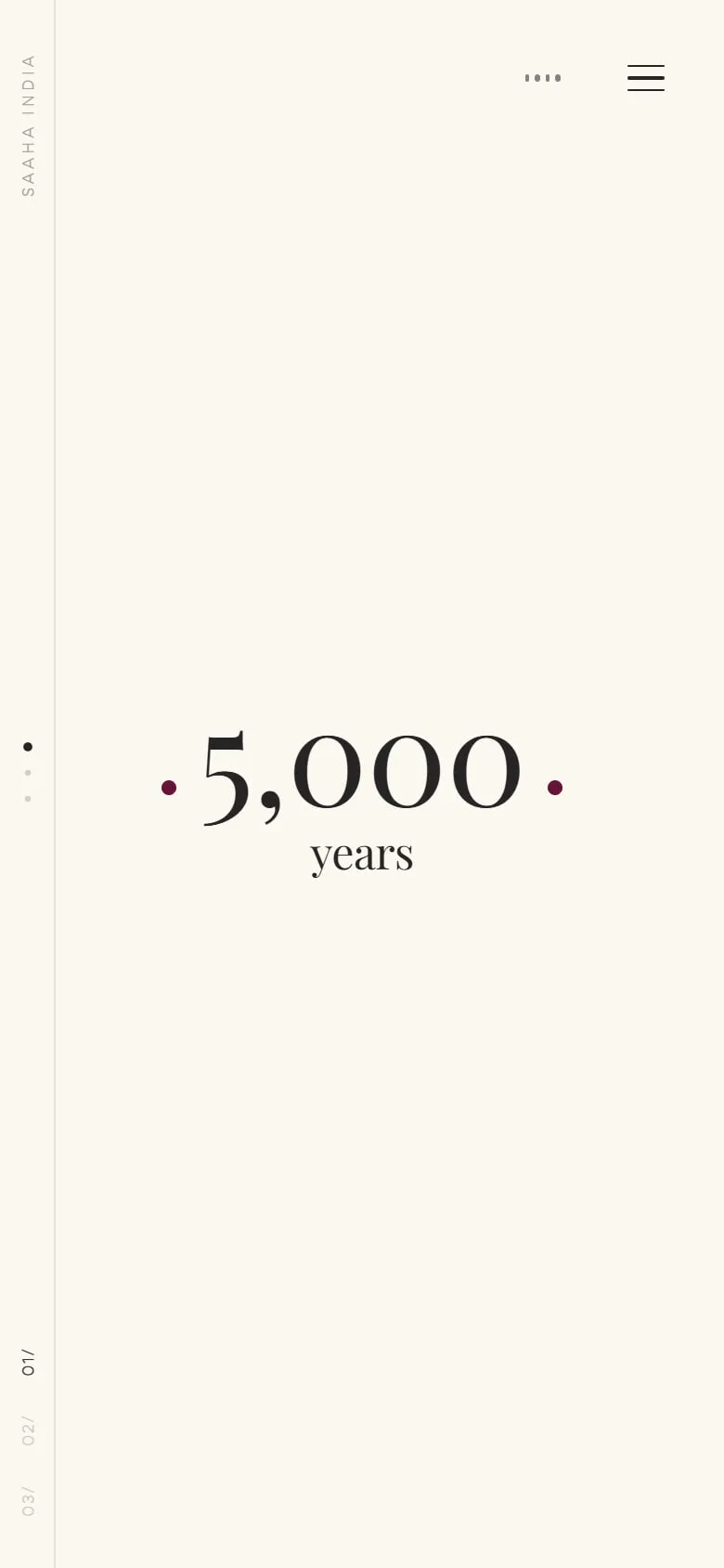
The site opens on “5,000 years” and asks who tells India’s stories before it shows a single artefact.
Let it breathe.
Scroll sets the pace. The music is there if you want it and off if you don’t.
Apply, don’t add to cart.
The one real action on the site is a considered one: joining the Collector’s Circle.
Outcome
What we built.
An opening that sets the tone.
A scroll-led sequence of questions about who tells the country’s stories and who signs its craft, before the first artefact arrives.
Artefacts with their stories attached.
Each piece shows its edition size, the story it comes from and what it’s made of: velvet and zardozi, lost-wax brass, sheesham and meenakari.
The making, in four stages.
From Khoj to Srijan, the process is told as a ritual, not a spec sheet.
A Collector’s Circle you apply to.
A multi-step application that saves as you go, so nobody loses a considered answer halfway through.
A journal and a founder’s note.
The long-form side of the brand, for the people who want the whole story.
Outcome
Where it landed.
“Grateful for the dream team. Pratham Chellani, for being most patient with all my bursts of design, doubts & icks. But more importantly for developing the website.”
Conclusion
What we took away.
An experience is mostly restraint.
What we left out (prices up front, carts, pop-ups) did as much work as anything we added.
Frame the founder’s taste.
The site is a setting for Saaha’s identity, not a second one competing with it.
Every doubt is a brief.
Each ick told us something Saaha isn’t, which is half of knowing what it is.
